Tuesday, May 22, 2018

Michael Lovelady


E9 Experience 4th Quarter


     So my e-Com final was interesting and fun. my team and I had to create a business and a product to sell in our business. so we started in animation were we had to create and add and a product design that was really tricky and I fell sick wile we were working on it so I wasn't able to finish my part, but it turned out fine because some one els in my group was working on the same thing. 

     While we were working on the product we decided that we would make a language interpreter or LI. LI got a lot of upgrades and changes as we thought of new things that it could do. our company was called Em-brace Global. we decided the name for it because we wanted our product to be a thing that brings the world together. that is why we chose to go towards a heart touching style.

     The project itself is that when we were finished with the product and the adds and the website we would try so sell it to some sharks. so we also had to work on a presentation and try to come up with things that people would ask about the product so that was fun and a little tiering.

     So after we finished the animation section we had to create a advertisement for a TV add witch was probably one of the easier things we did. shout out to Mrs. Zimmerli for being one of the best film teachers no offense Mr. Cooper but I haven't had you as a teacher "YET". so the ad was pretty easy to come up with an idea but making that idea come true was the hardest part of that. part of the product.

     After the video portion is were the fun really started to begin with graphic design and web. at first there was a big deduction on what to do for the logo but after a while it became clear. we all decided to keep the idea of the earth. 

So all and all my E9 experience was pretty good fun hard and really gave me more of a purpose in what i want to do in the future.
     

Thursday, March 8, 2018

WEB EDITOR

AustinTothen


Such "FUN" stuff wed design... Yeah... "FUN" 

Not really web design is long annoying and precise. I really don't like it and most people don't. So while i was working on this project i messed up really badly and changed the things in the same place and i had to go into the coding delete the coding for all that stuff and then redo more then half the page it turned put how they wanted it i think, so it can't be that bad.


Honestly i really don't like web design its not bad and can be fun but if you mess up even once it can ruin the whole thing.


FINISHED PRODUCT

("ITS NOT THAT BAD")
; )


Friday, March 2, 2018


HOW WELL DO YOU WORK WITH OTHERS?


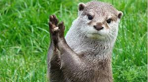
We had to take a test to see what kind of animal you are based on how well you work with others. there are 4 different animals you can be. A LION, A OTTER, A GOLDEN RETRIEVER, AND A BEAVER.


I got OTTER

As an Otter i work well with others in a playful manner, i get what needs to be done in the most fun way possible and i'm extremely spontaneous about my decisions.


This test i think was really accurate, honestly when i'm working in a group i will work hard but  not to hard were i can have some fun along the way.

So yeah i'm an OTTER...


Thursday, March 1, 2018

AustinTothen


LOGO
Logos are some of the most important thing when it comes to business, its the customers first interaction with the company. so it is very important. i was tasked to make my own logo so that is what i did.

THE PROCESS
the process of making a logo is not very hard if you have an idea of what you want, first you pick a shape depending on what your logo is for. then you makes you logo (in black and white). mess around with it to make sure thats what you want and then just color it but make sure it fits.


THE FINAL PRODUCT

FINAL
This was my final outcome, it took a bit to figure out what to do with is and find out what colors fit but in the end i thought it came out really well.


LOGO PLACEMENT

PLACEMENT
finding a place to put it on is probably the hardest part, so i didn't really try but this is what it could look like.


WHO AM I
I had to take a test on who am i and what am i like. heres my results,


Monday, February 5, 2018

Austin Tothen


     This is a wizard of OZ poster. In E-Com we were assigned the task of editing an older version but we have to use the same info but make it our own. By changing the fonts rearranging things colors and sizing. We had to make sure it had all the parts of a very well made "saying" i guess you could call it, i know there is a word for it but i don't really want to spend time looking it up even though i could have used the time it took me to use this sentence to search it up, BUT yeah. So the thing is called C.A.R.P originally C.R.A.P, But you probably already know why it was changed. C.A.R.P stands for: CONTRAST, ALIGNMENT, REPETITION, REPITION,ANDPROXIMITY   .

So yeah CARP


 CARP may seem like just a thing you would do normally and it doesn't seem like something that you would need to worry about, the truth is that CARP it used in almost anything including the most insignificant things. Its in Pictures, and Posters. it can even be used for more than just pictures, say if your making a video and you want things to stick out you probably use some of the things CARP has for advice.

All and All C.A.R.P Can make a very huge impact.
(SEE WHAT I DID THERE)


Thursday, January 25, 2018


WHAT SHOULD MY WALLPAPER BE
!!!!!!!!!!


SERIFS
Serifs are the little tings on the end of letter to make the look like this (THIS) So had to make a project describing them in a font. Want to know a secret if you want to make a typed message more important then you need to know the right fonts. ( DON'T USE COMIC SANS) even though it is an amazing font you shouldn't use it for important things, but if the thing you are typing is not very important then it's a very fun font.

  Photo Portfolio Part 1: Sophomore Year College, Video and Photography Class.